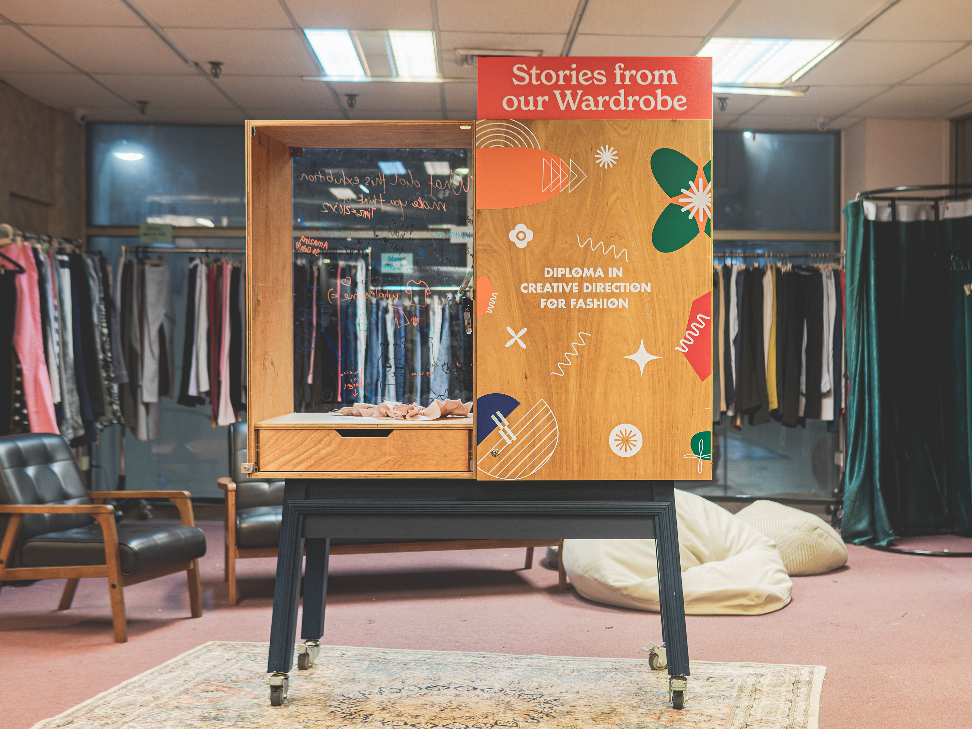
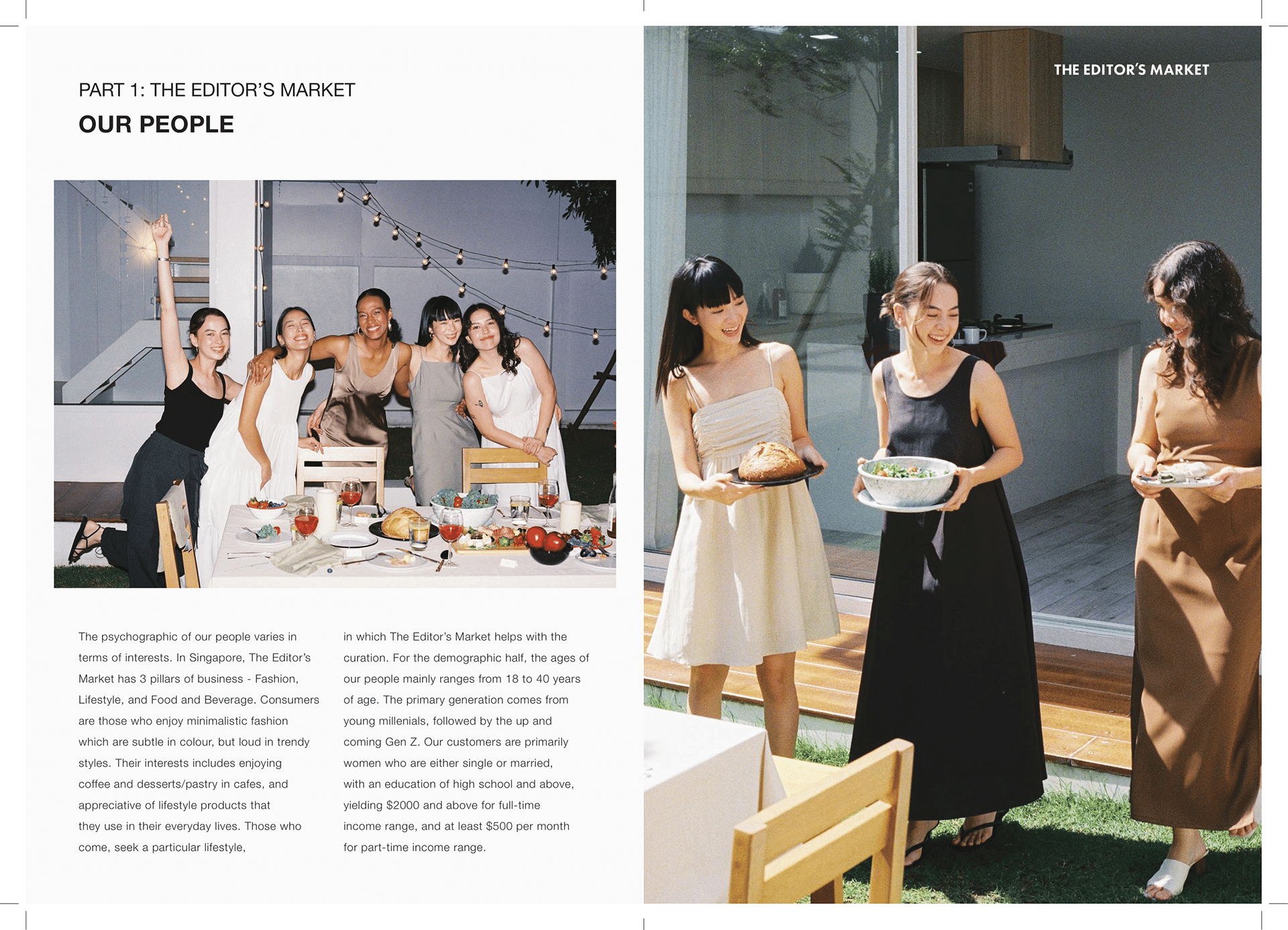
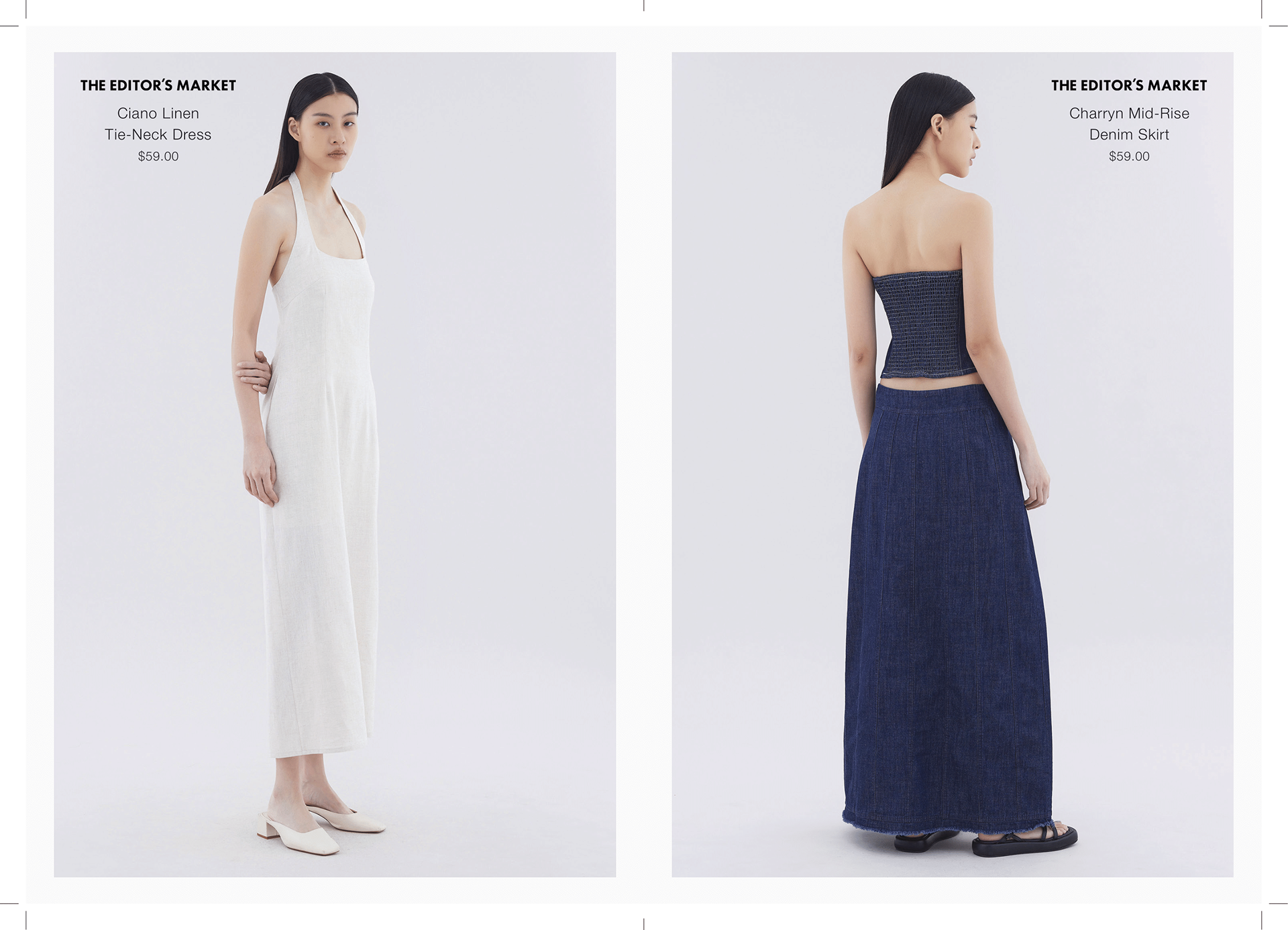
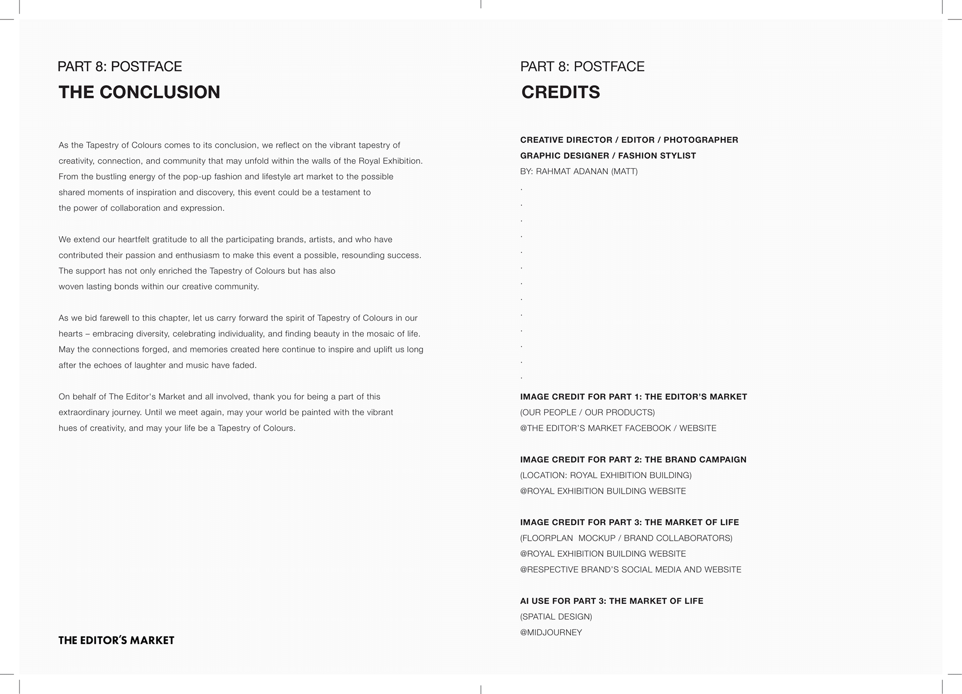
"The Tapestry of Colours is an Integrated Marketing Campaign (IMC) based on the Singaporean fashion lifestyle brand, The Editor's Market. This is an academic project that I executed during my time as a Diploma in Creative Direction for Fashion student at LASALLE College of the Arts. The main deliverable was to produce an IMC booklet (printed) that talks about the brand, while proposing new campaigns, and the PR strategies to market it. This project was to be executed in a group of 4-5, but I undertook it solo to challenge myself. I accomplished the whole creative process myself, from ideation to post-production. Do refer to 'Part 8: Postface' for full credits."
ABOUT THE CONCEPT
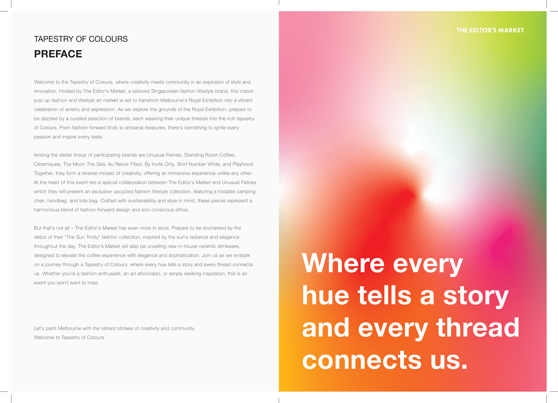
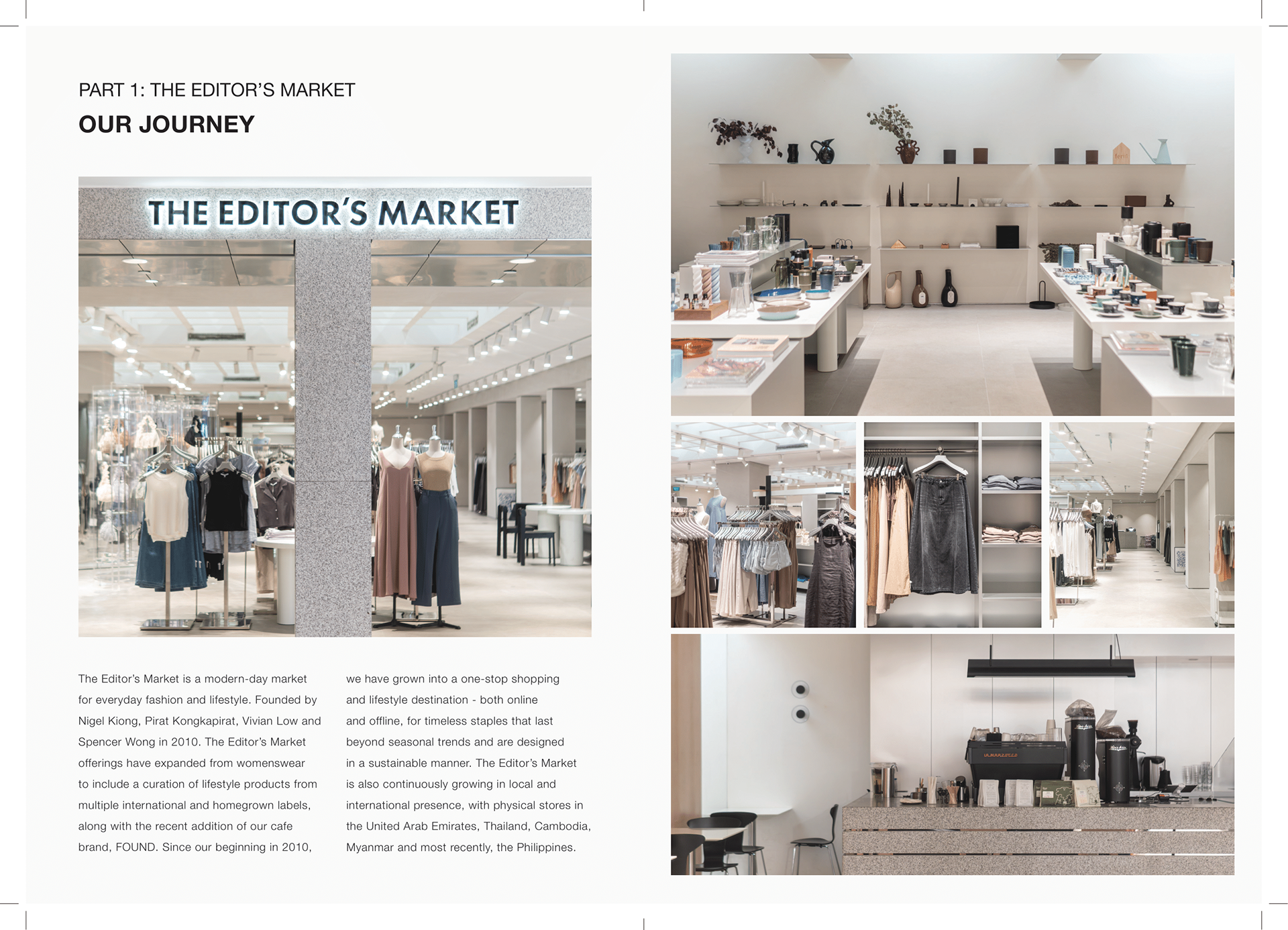
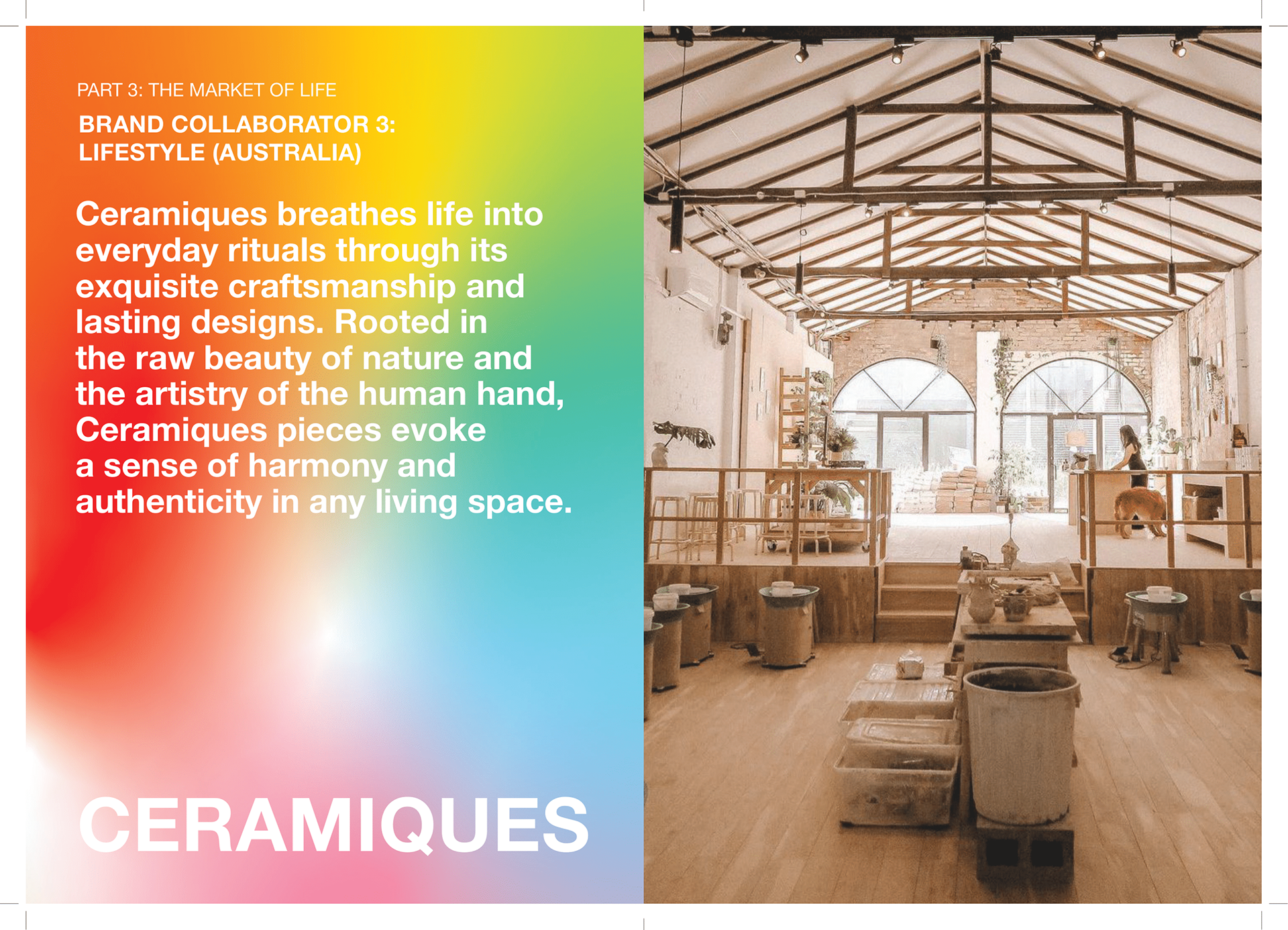
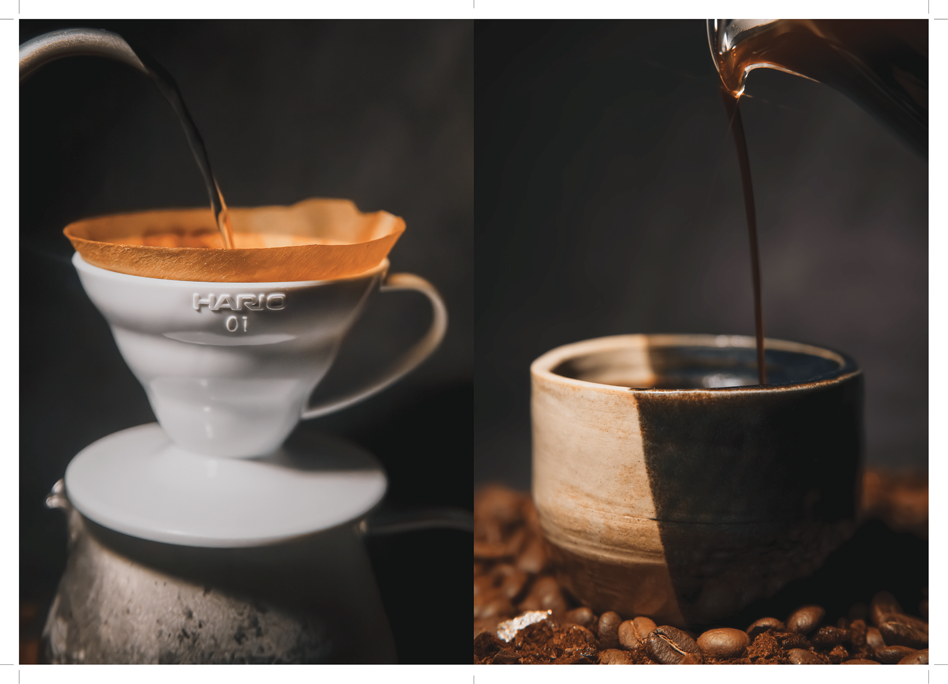
The main requirement was to select a local brand to promote in Australia, using relevant and relatable campaigns to attract a new demographic of consumers, to ultimately lead to TEM opening its first brick-and-mortar store overseas. Tapestry of Colours is The Editor’s Market’s debut pop-up art market in Melbourne, Australia, designed to connect with Gen Z and young millennials through a curated showcase of fashion, lifestyle, and coffee culture.
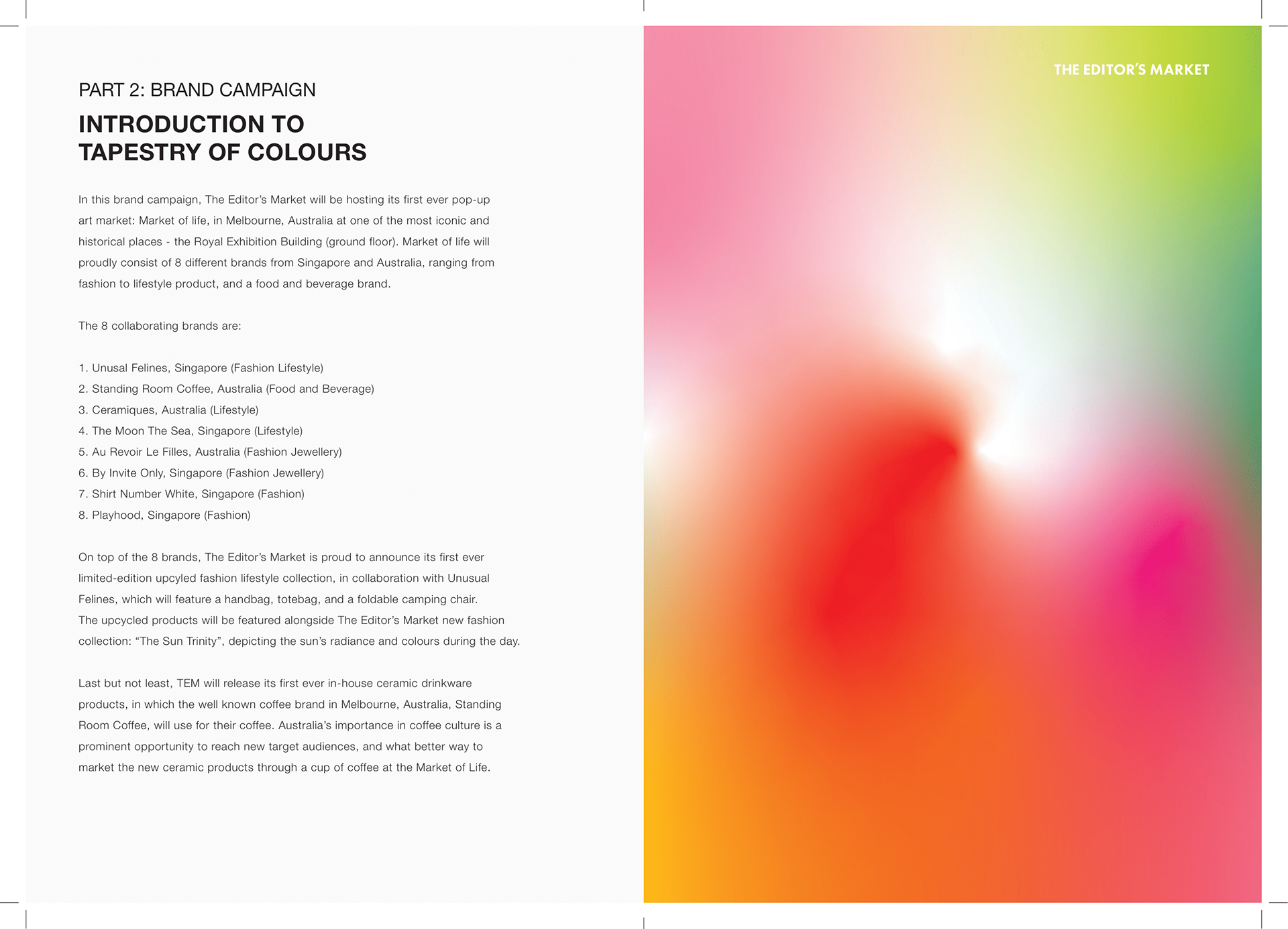
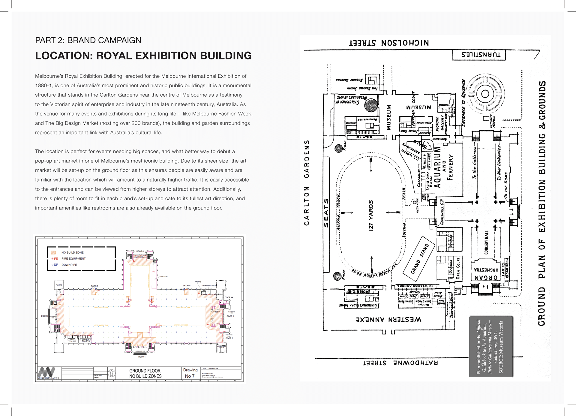
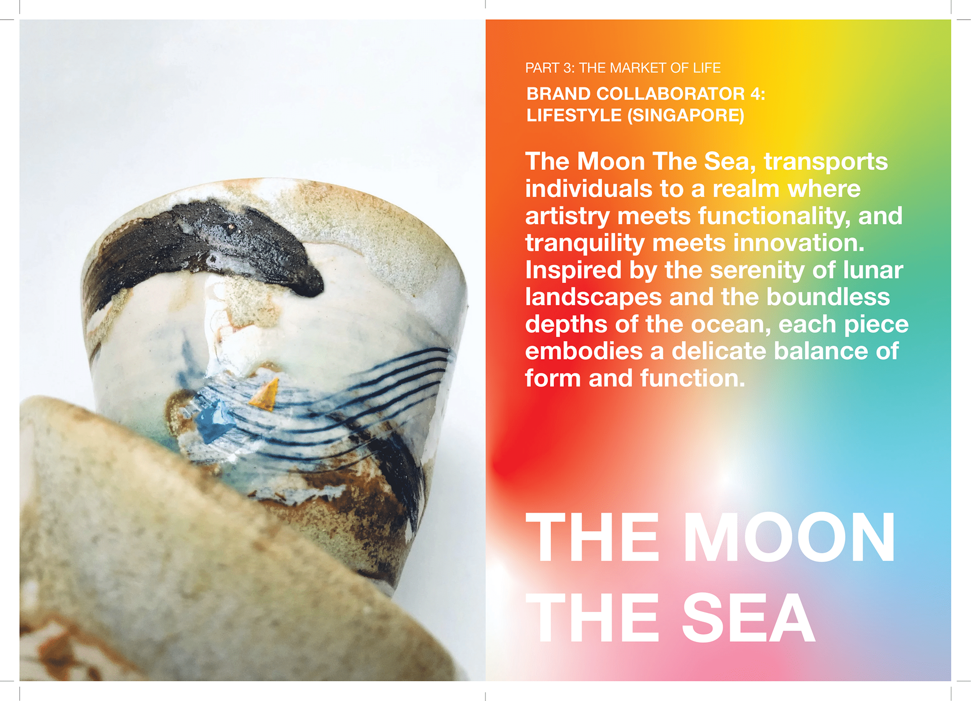
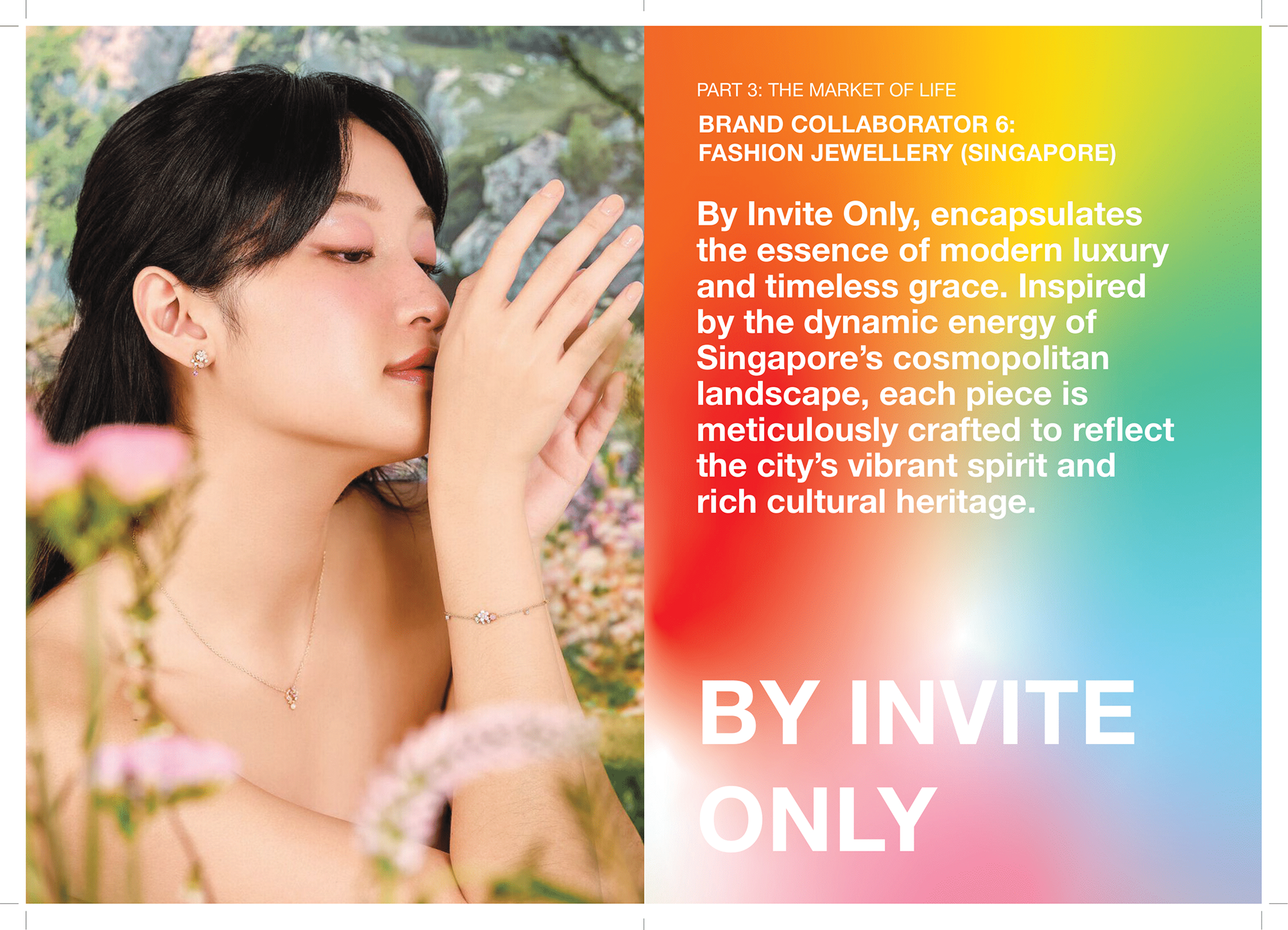
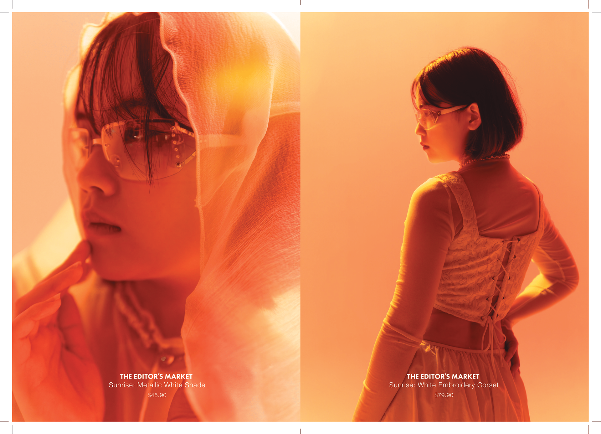
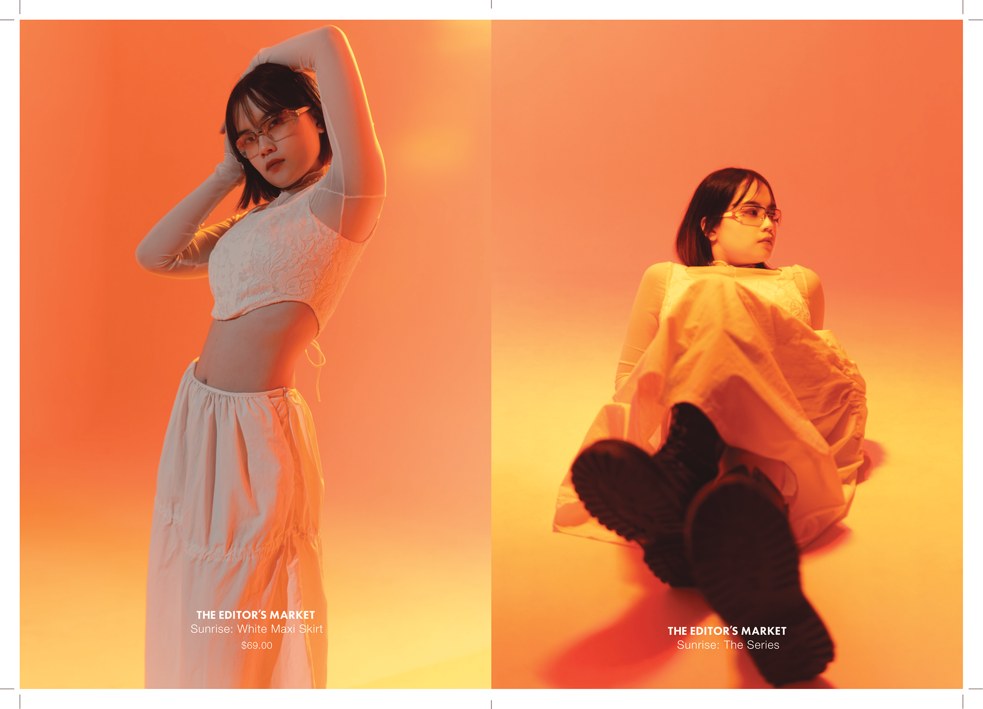
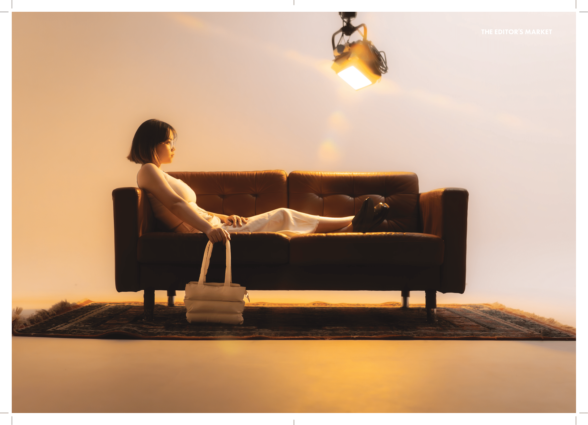
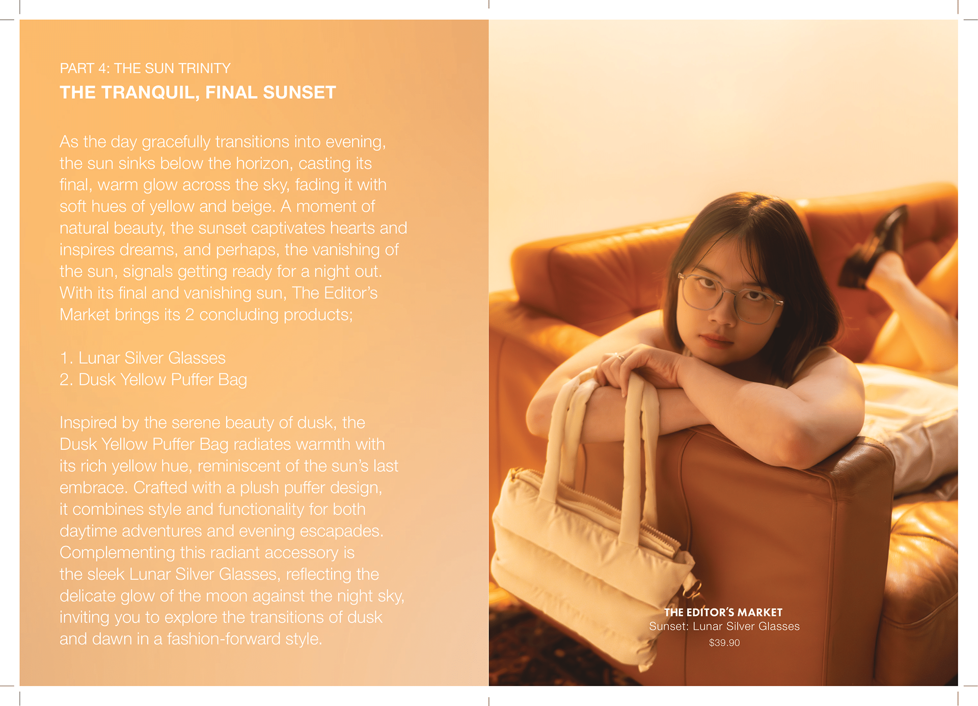
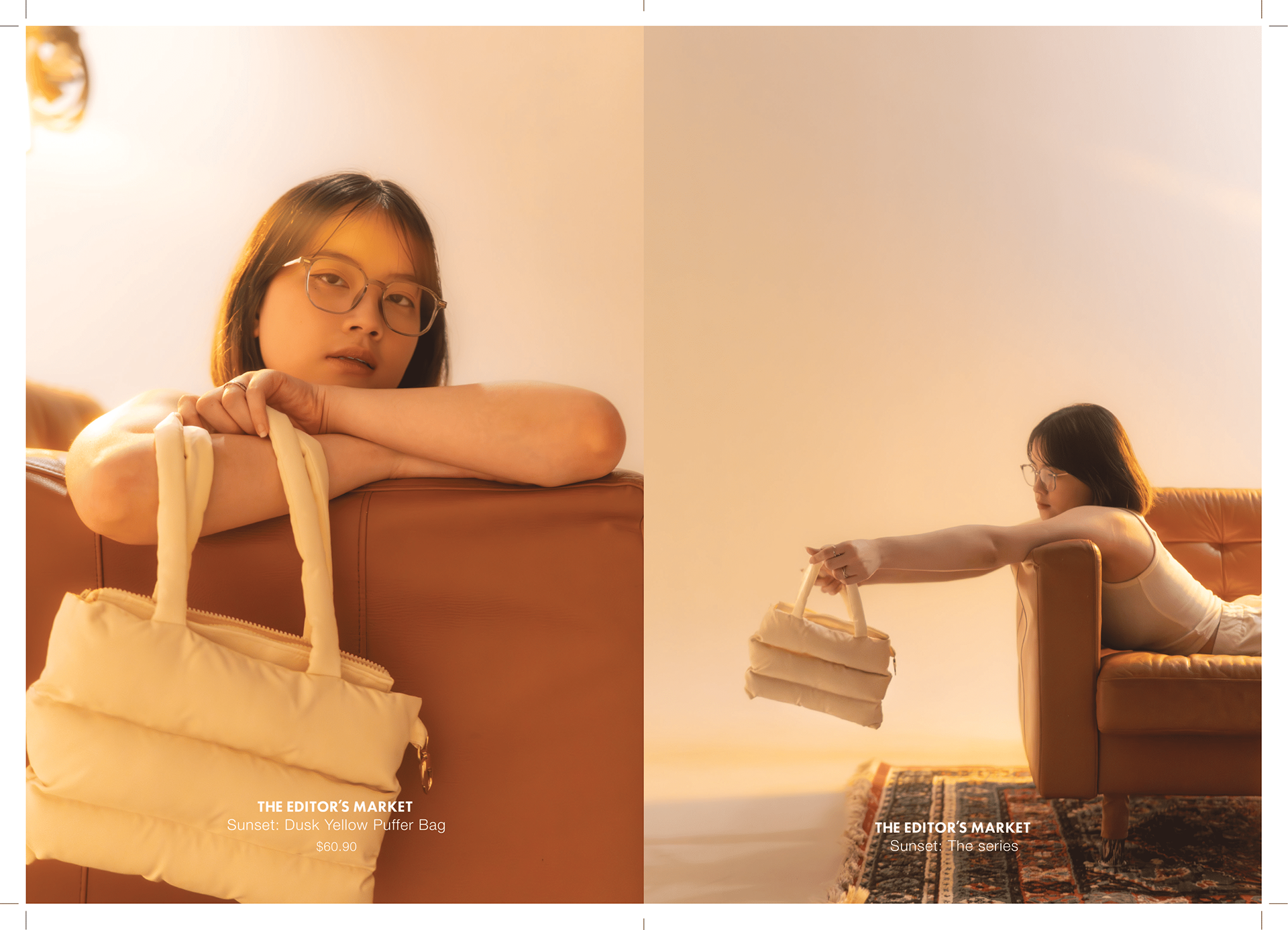
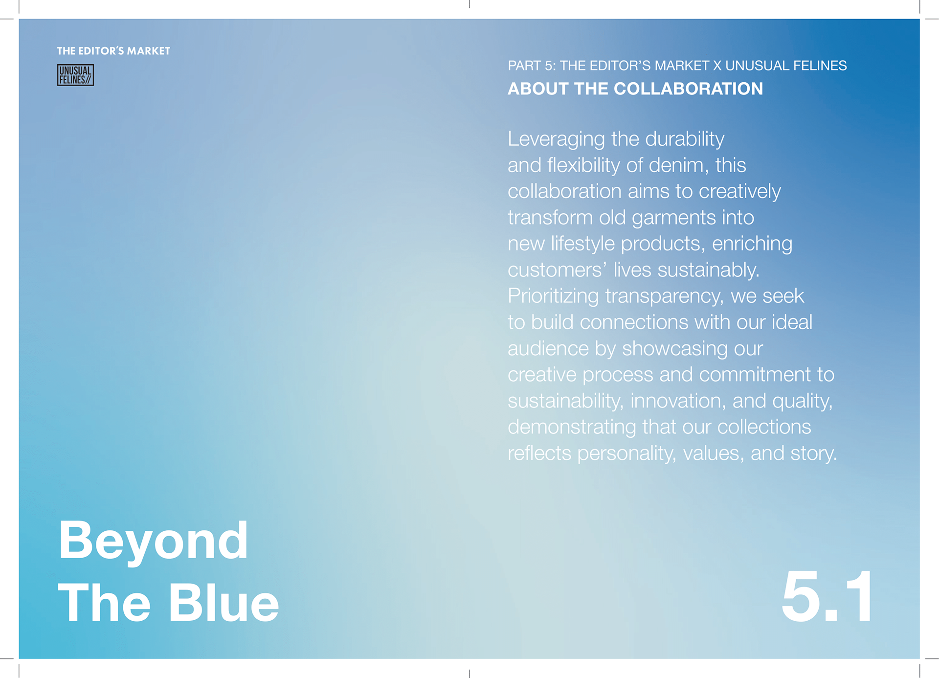
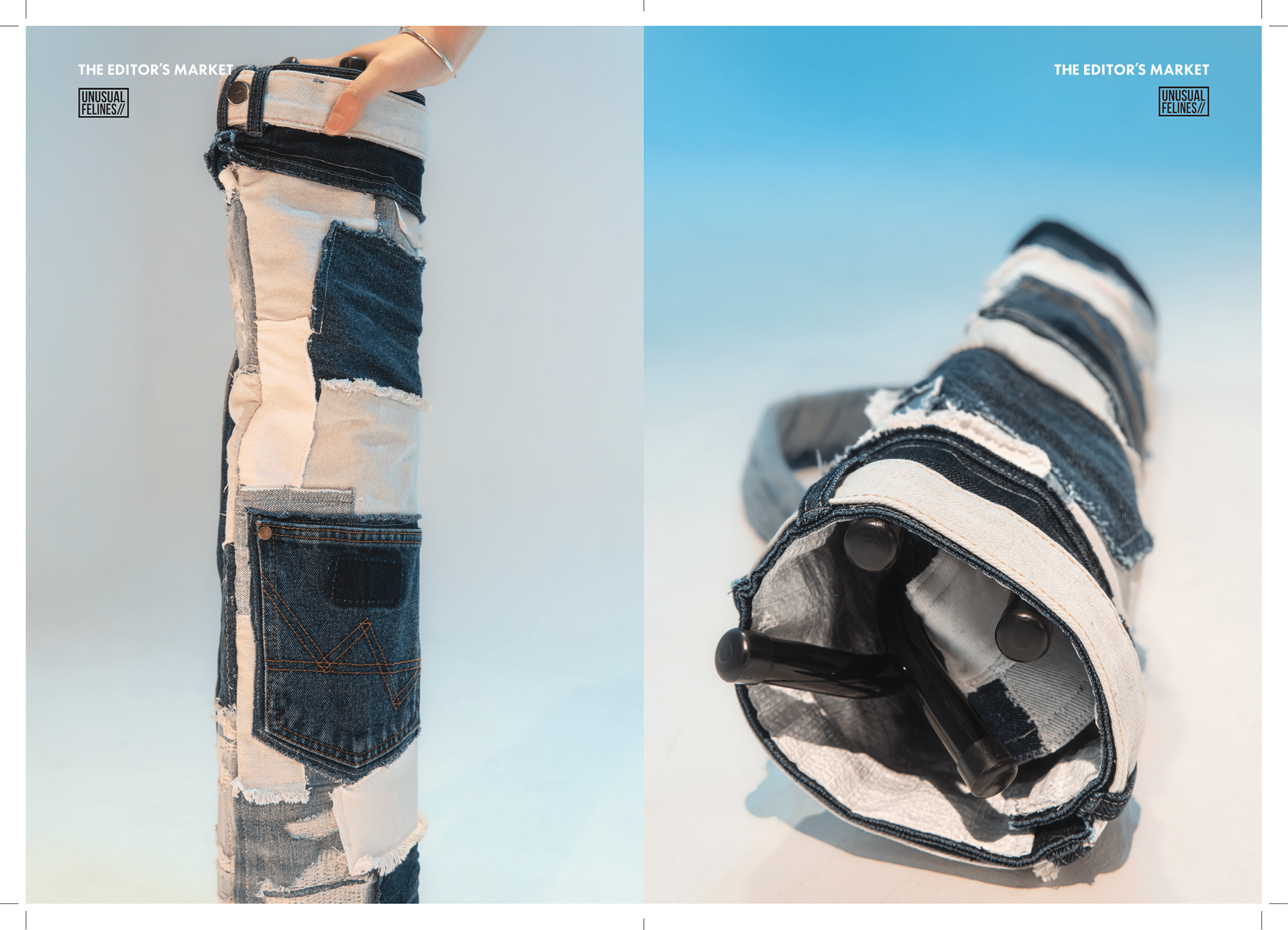
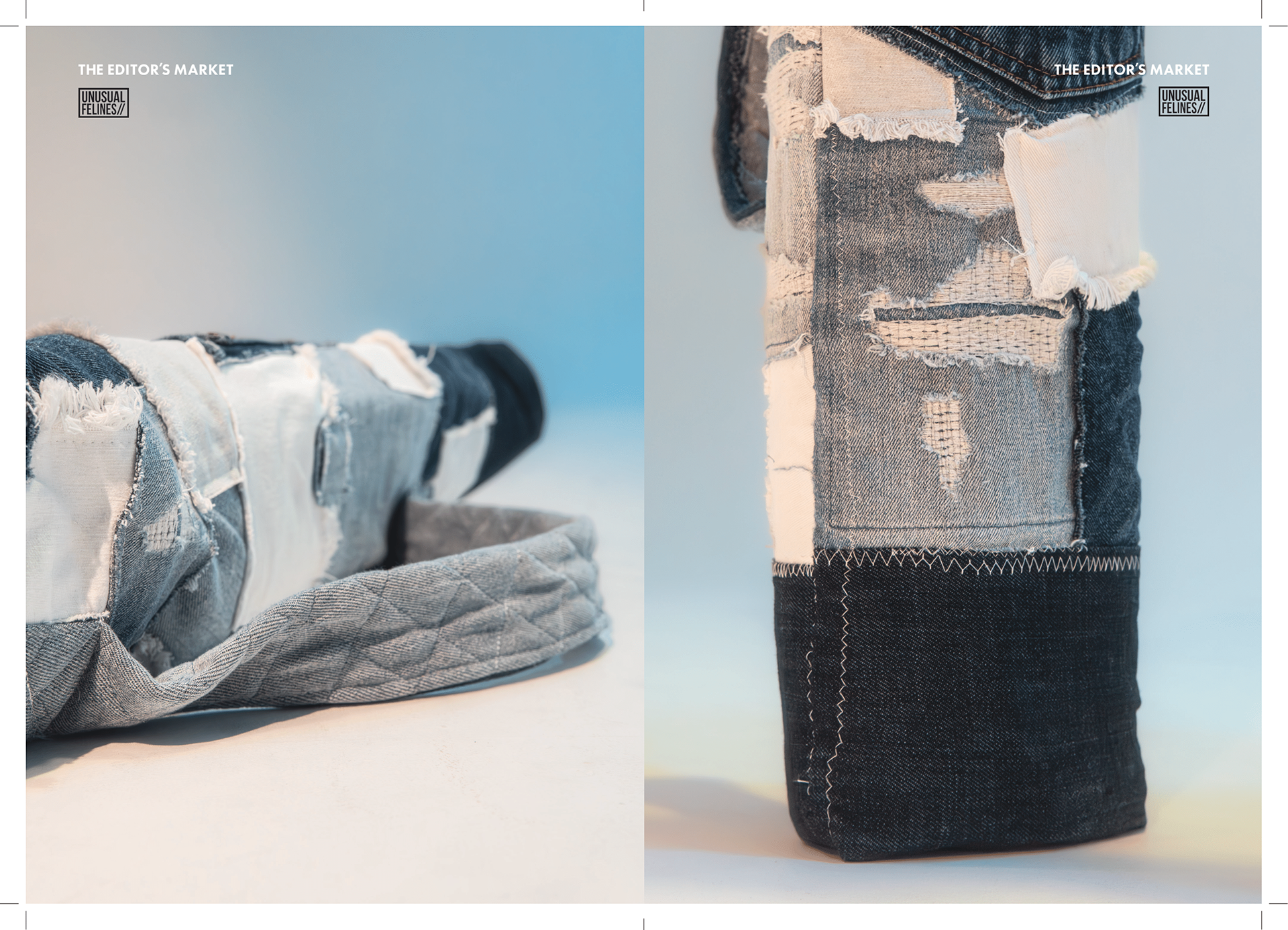
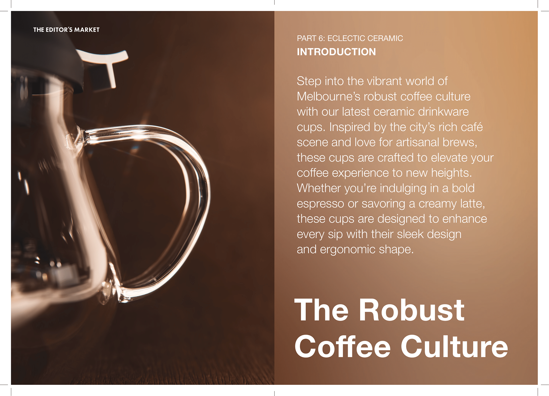
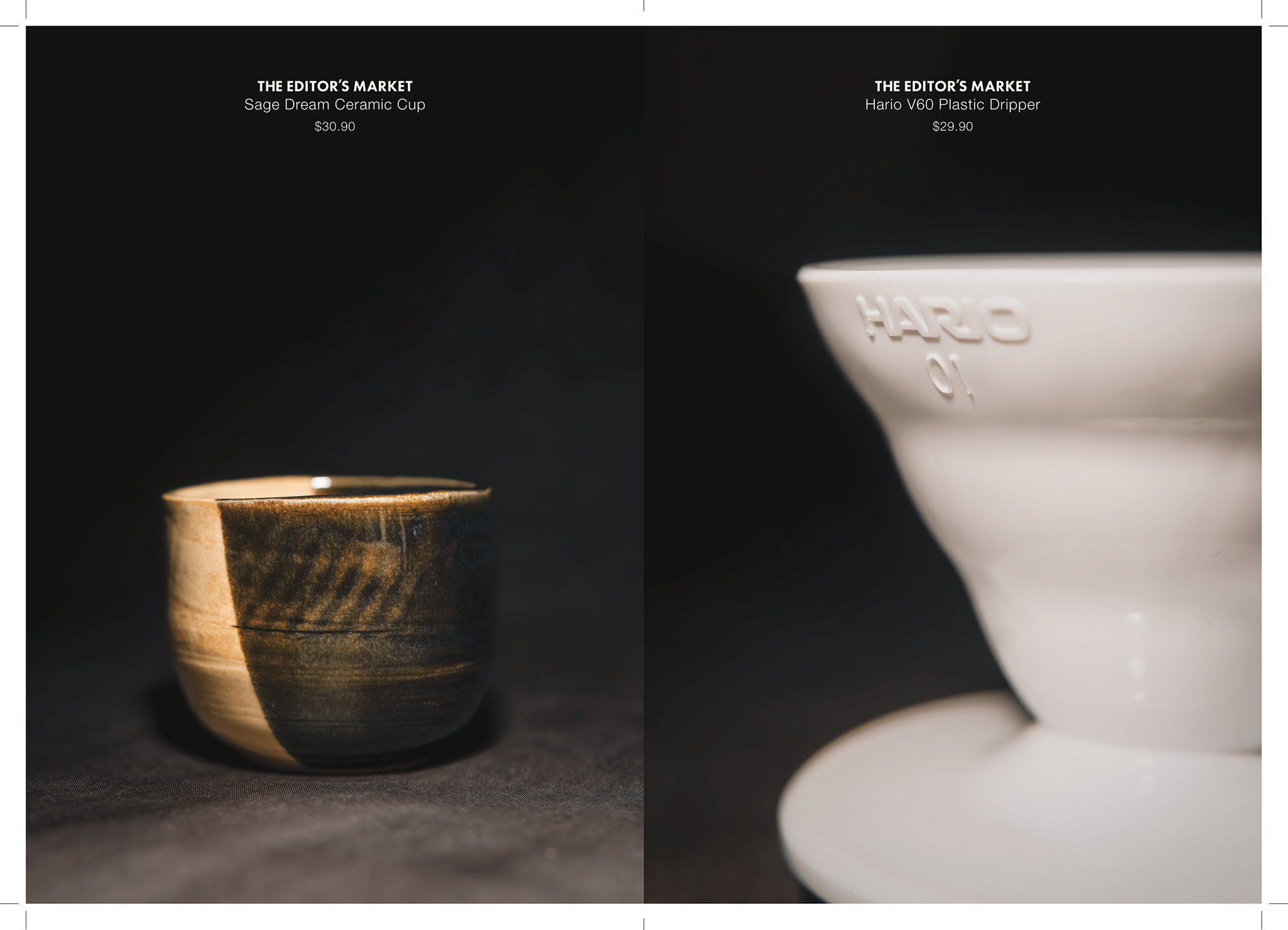
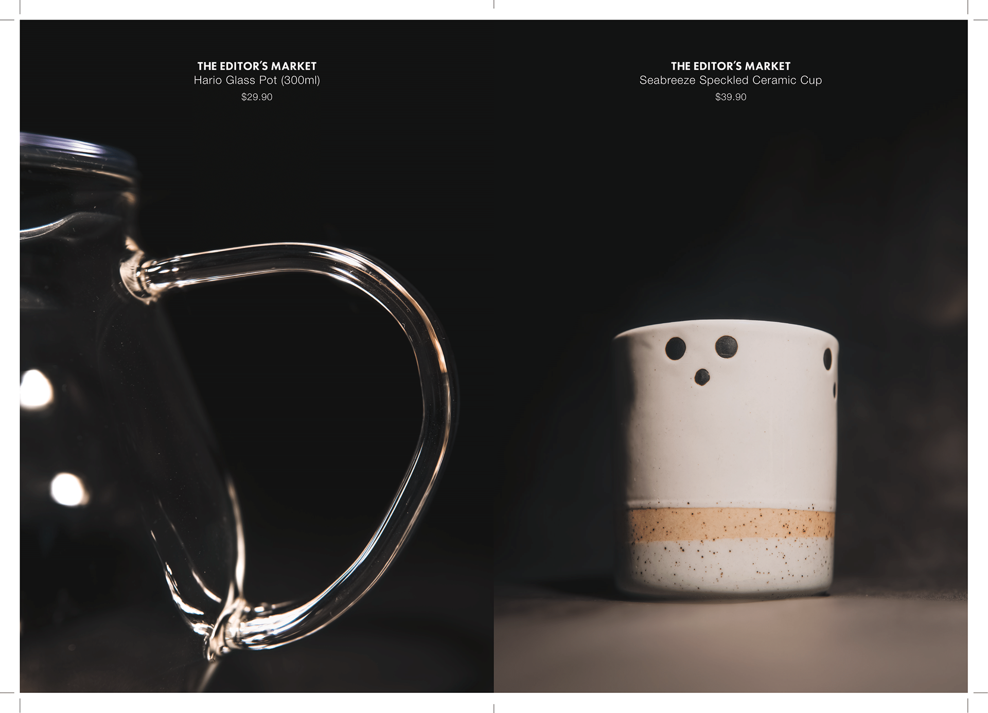
Held at the iconic Royal Exhibition Building, the event unites eight Singaporean and Australian brands to celebrate creativity, sustainability, and self-expression. At its heart is a special collaboration with Unusual Felines, presenting an exclusive upcycled fashion lifestyle collection alongside TEM’s new fashion line, The Sun Trinity, and in-house ceramic drinkware. The objective is to build a deeper connection with like-minded audiences, champion cross-cultural brand collaborations, and ultimately pave the way for TEM’s first permanent store in Melbourne.
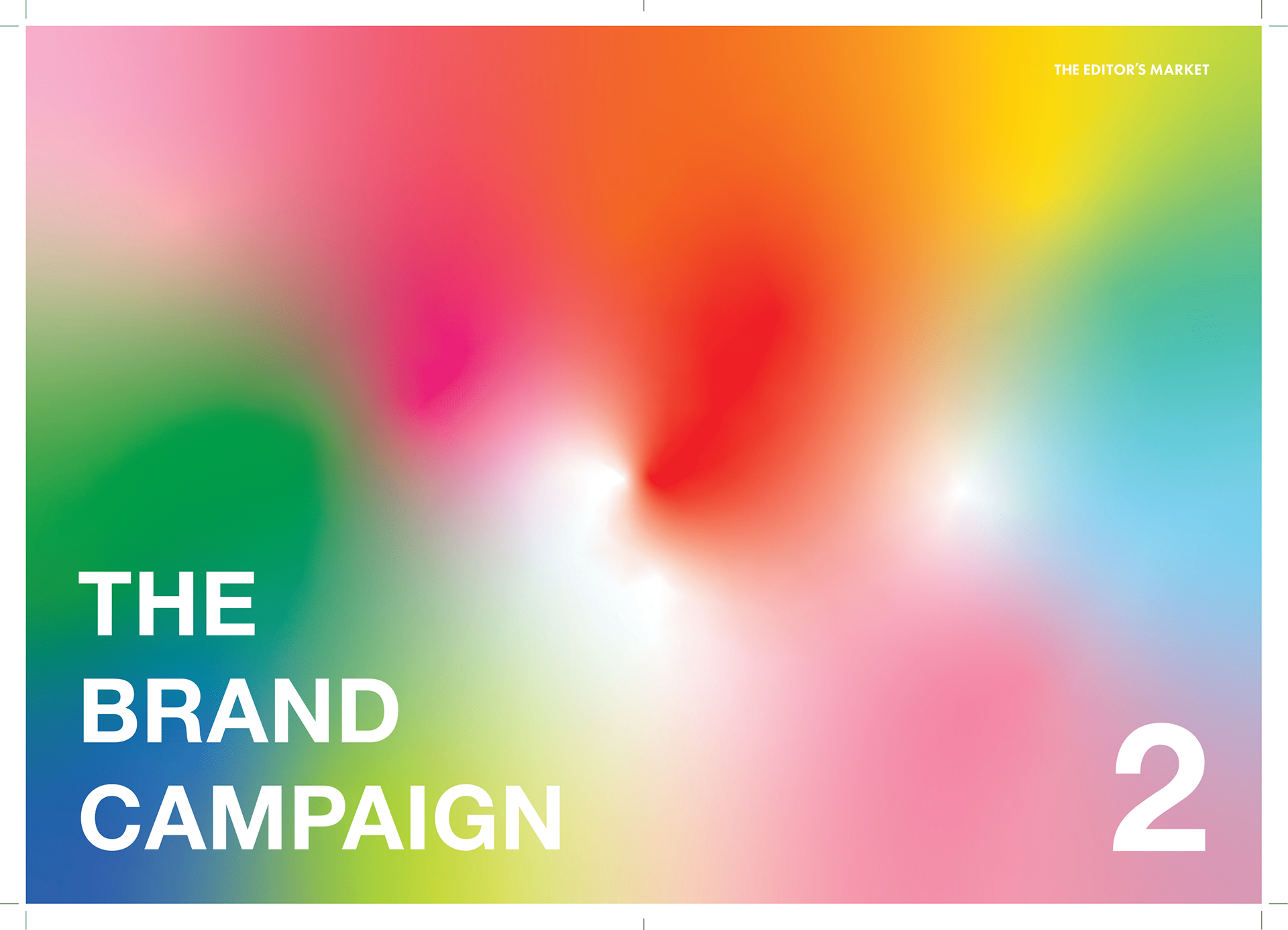
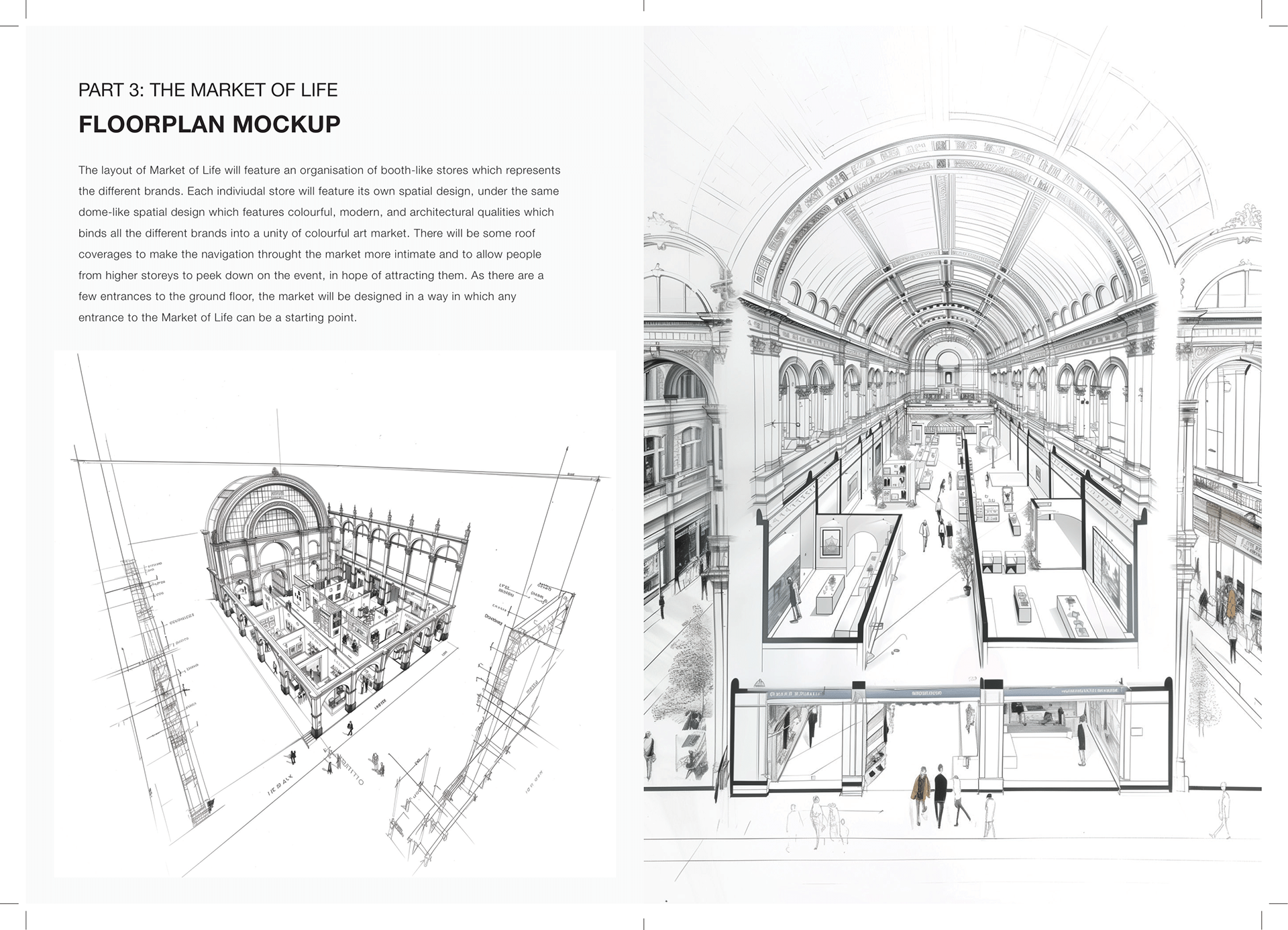
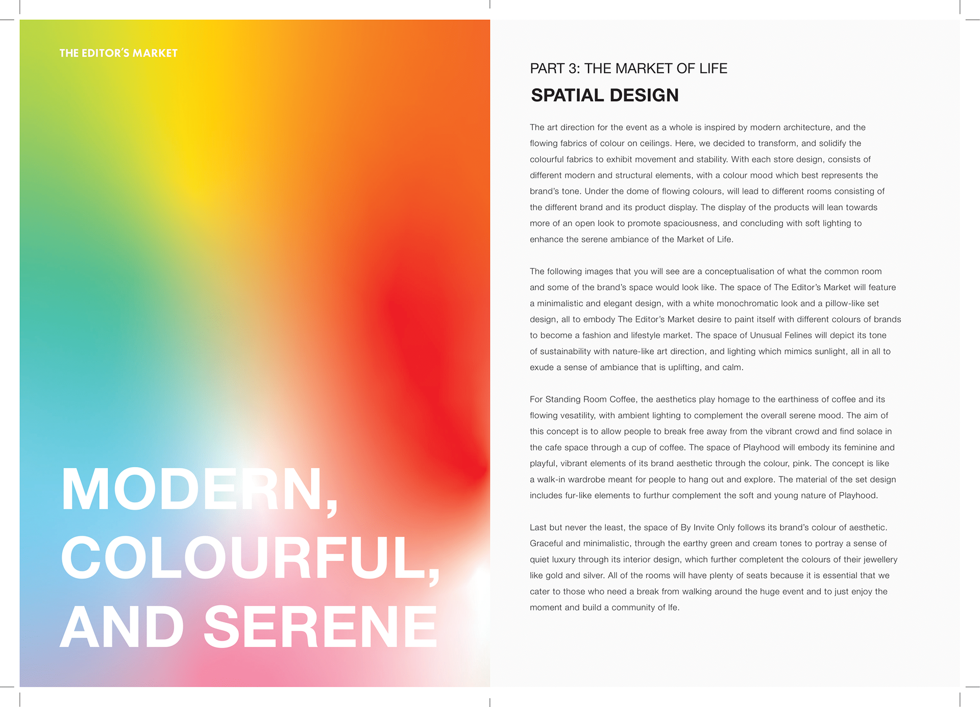
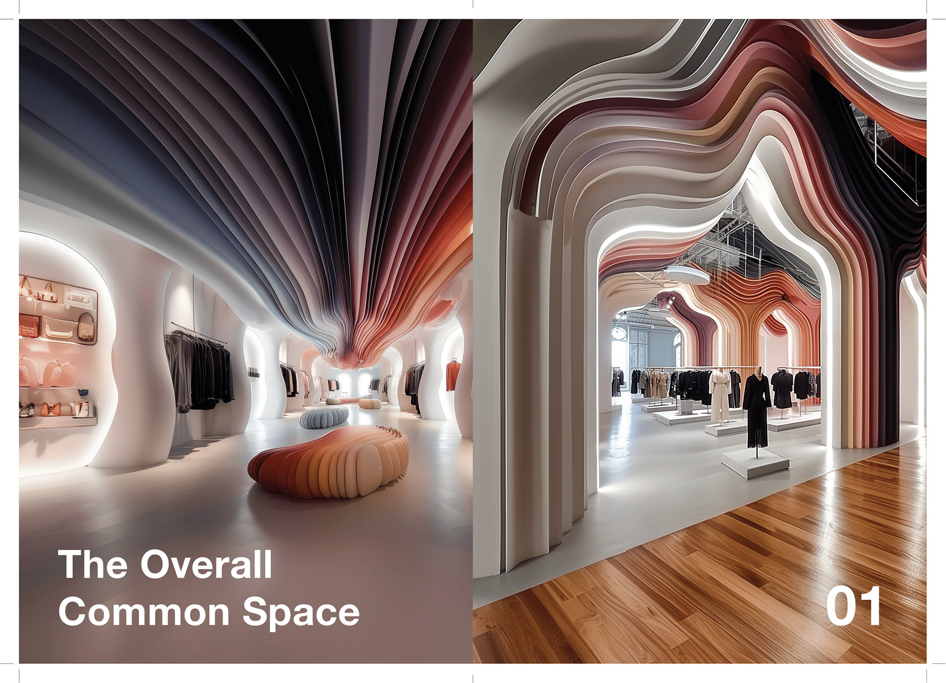
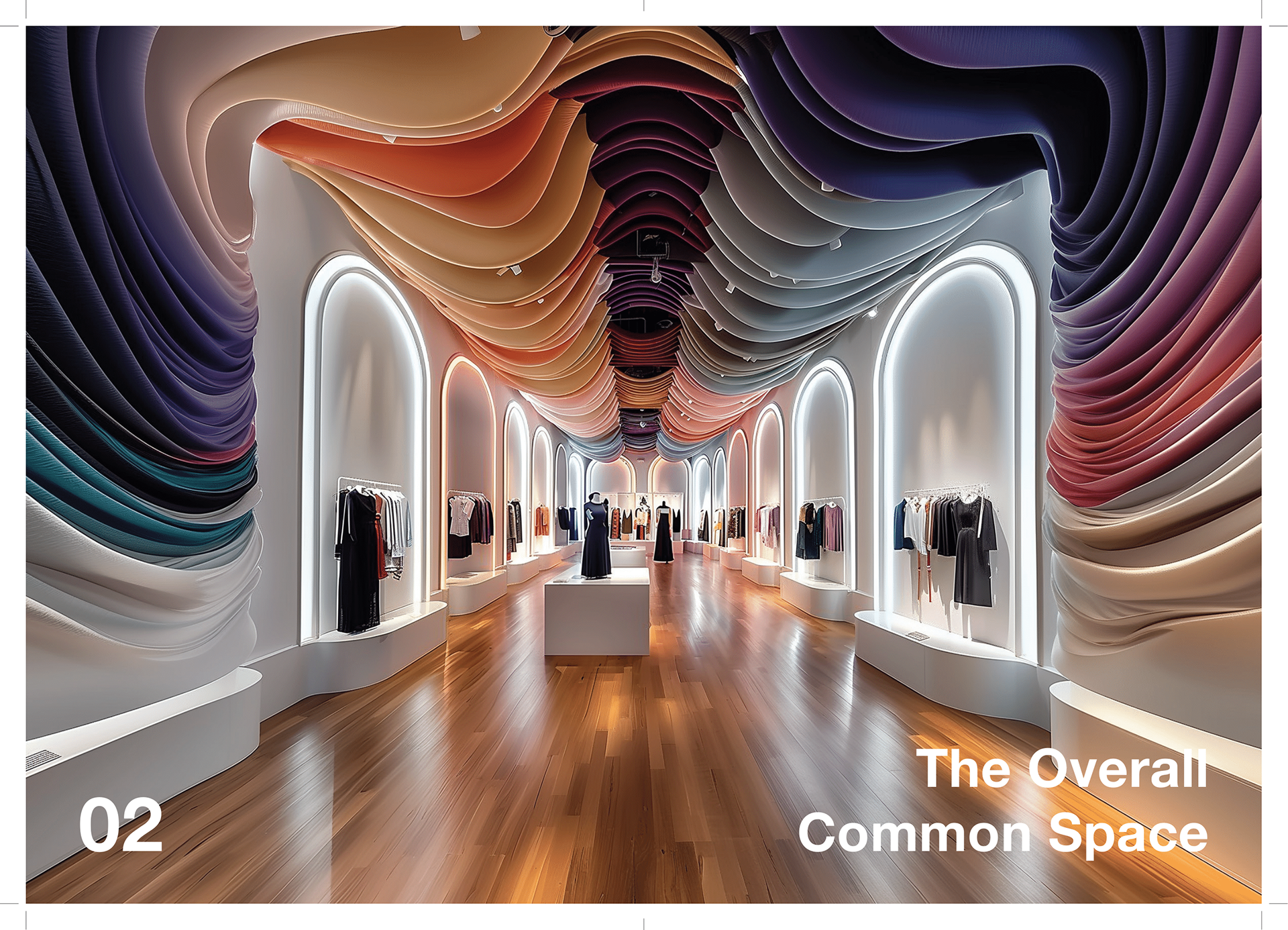
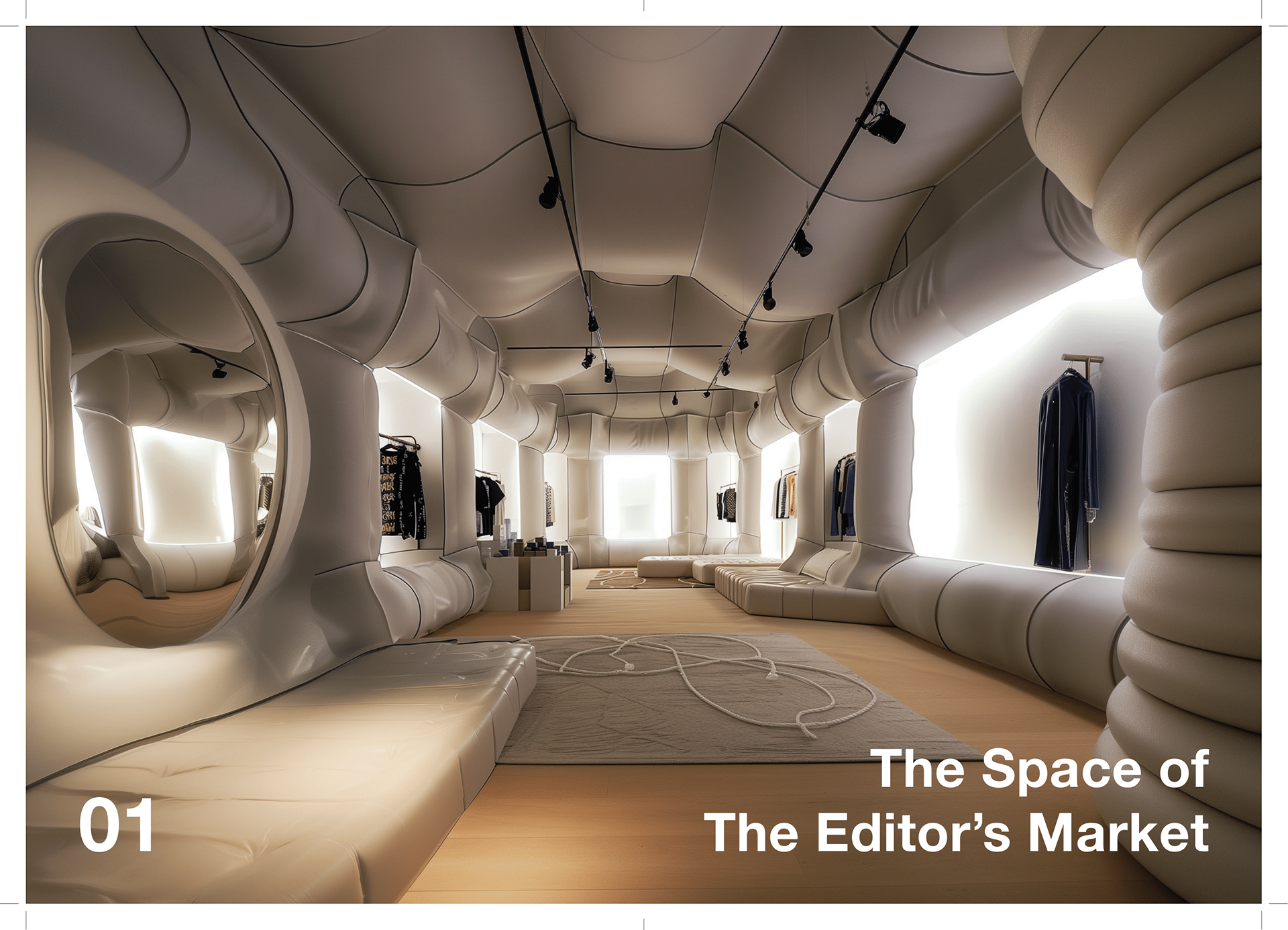
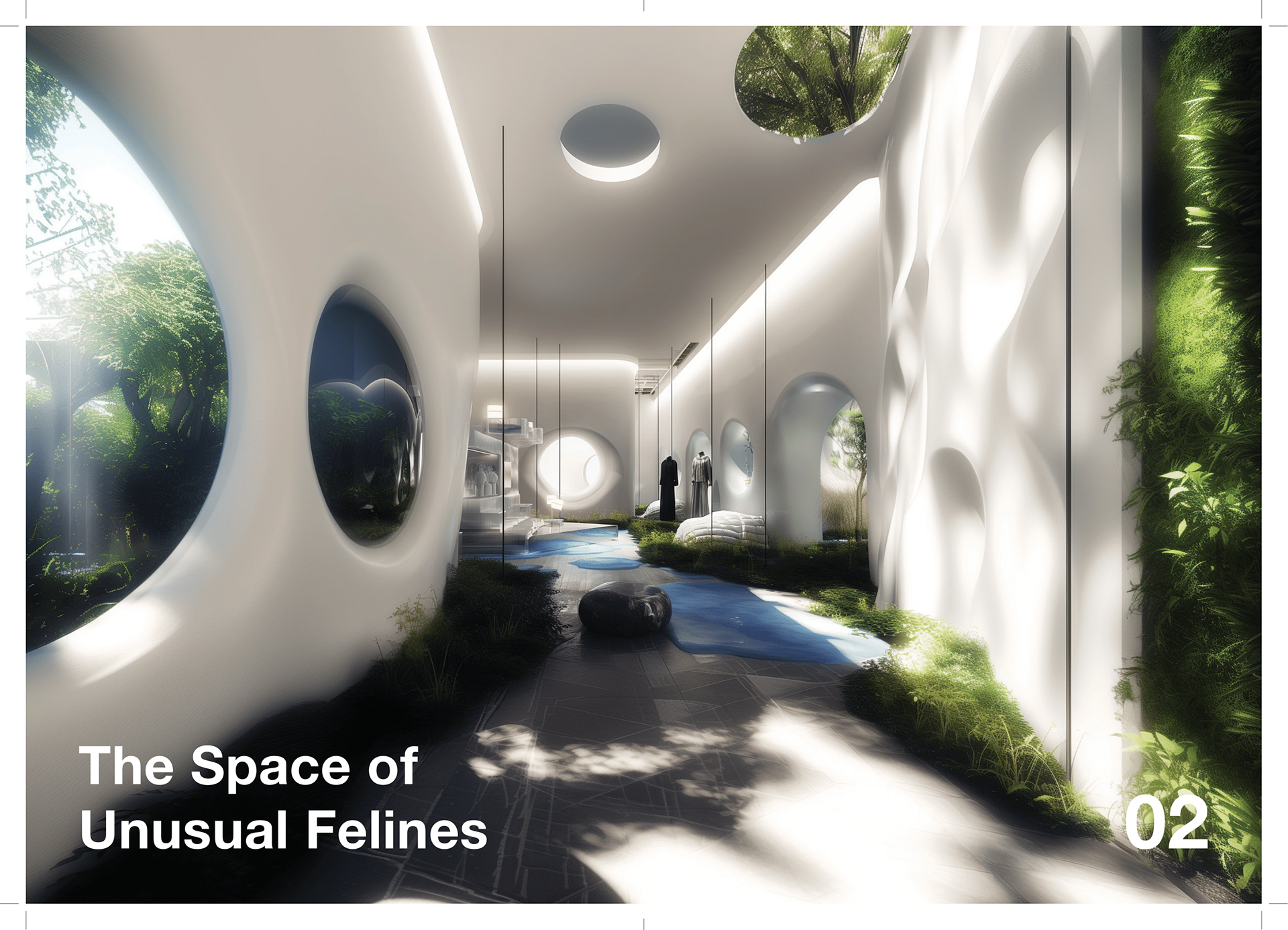
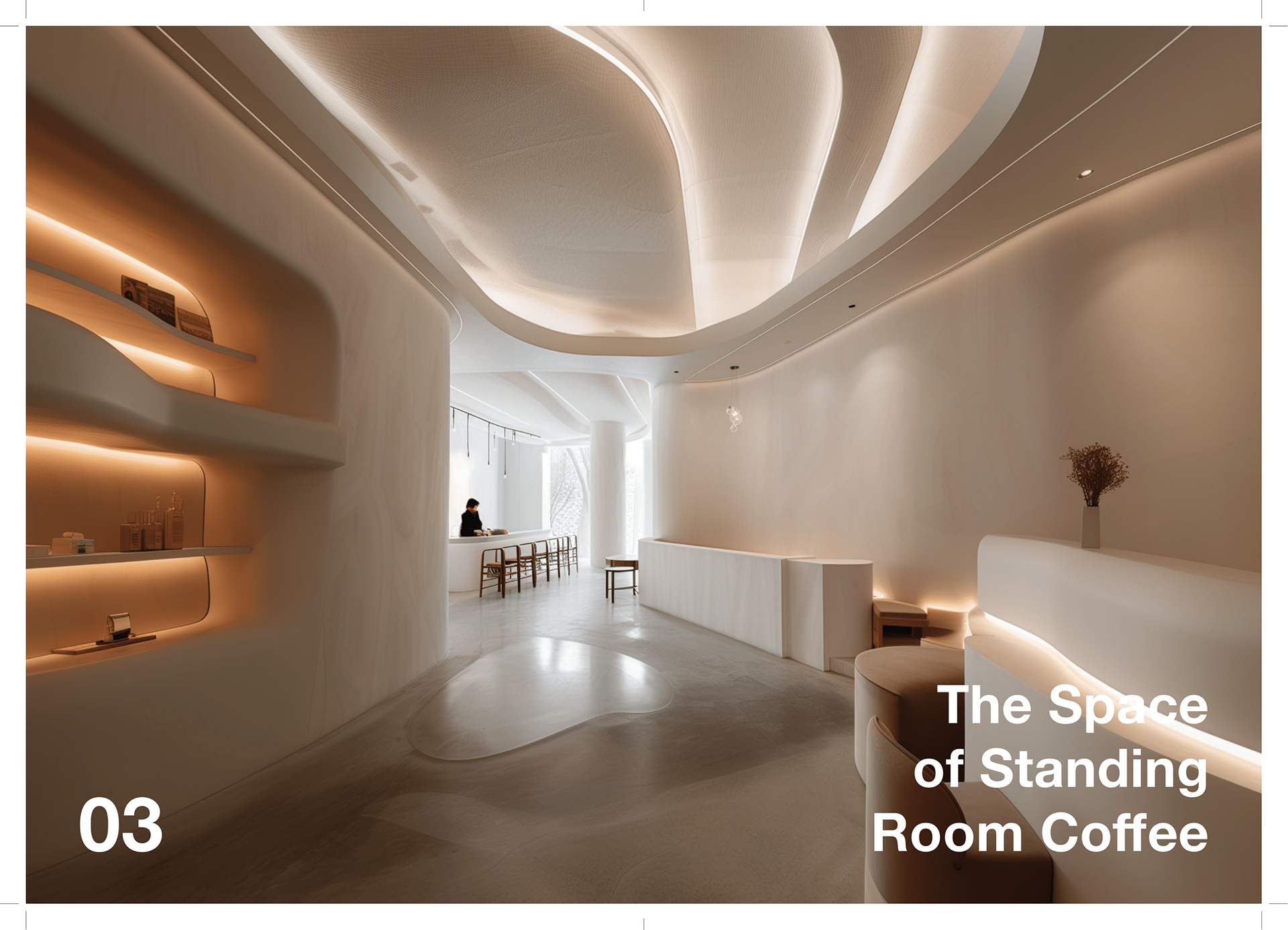
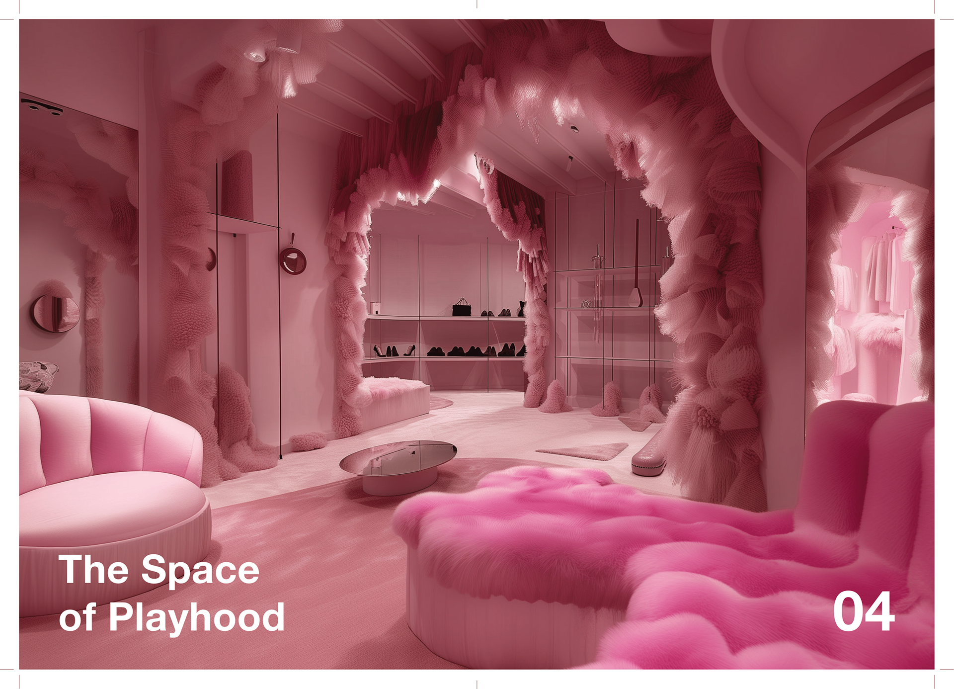
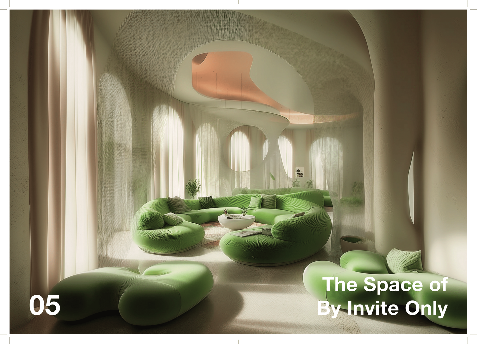
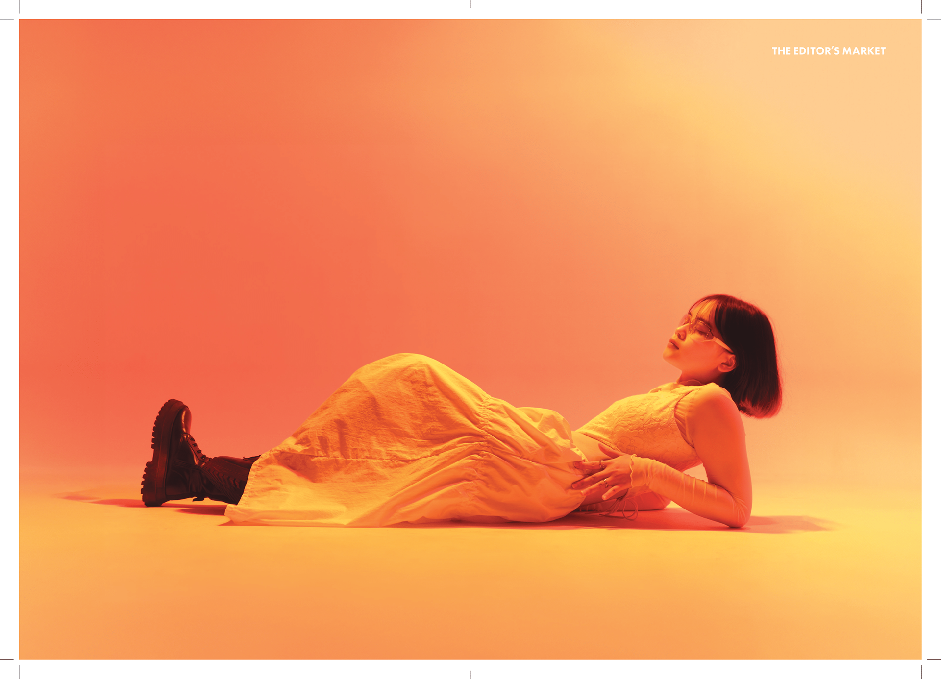
For my design system, I was heavily influenced by the aesthetics of Apple's visual language. It was clean, minimal, and easy to understand. Using a mixture of big, bold, light, and subtle typography, I hoped to keep the text flowing but structured, and not stagnant. I used a multi-colour palette that I designed to further support my concept across my IMC to solidify a consistent visual language. This project was also the first time I used Midjourney for support, to create AI images of my event spaces and floorplan mockup.





















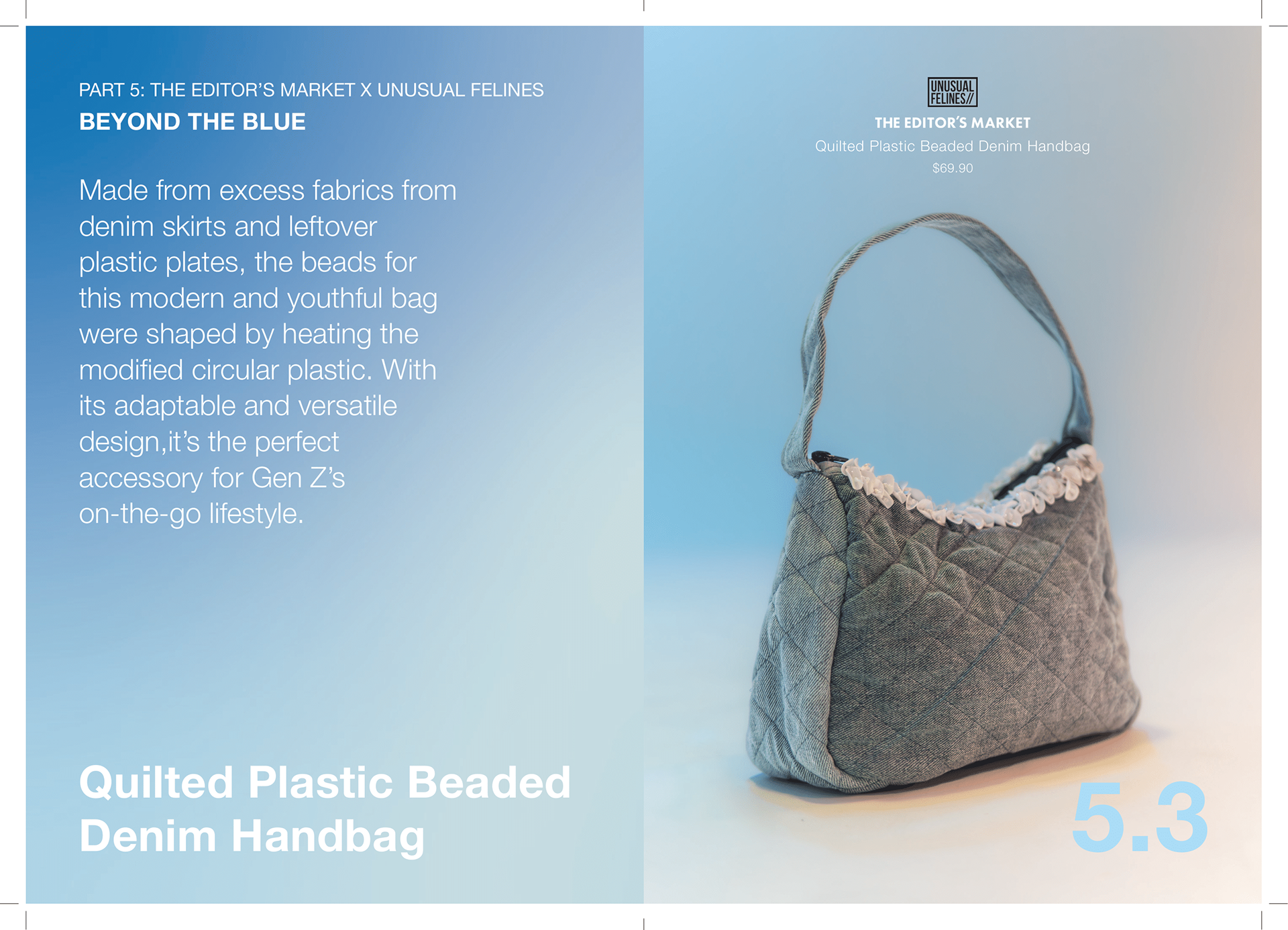


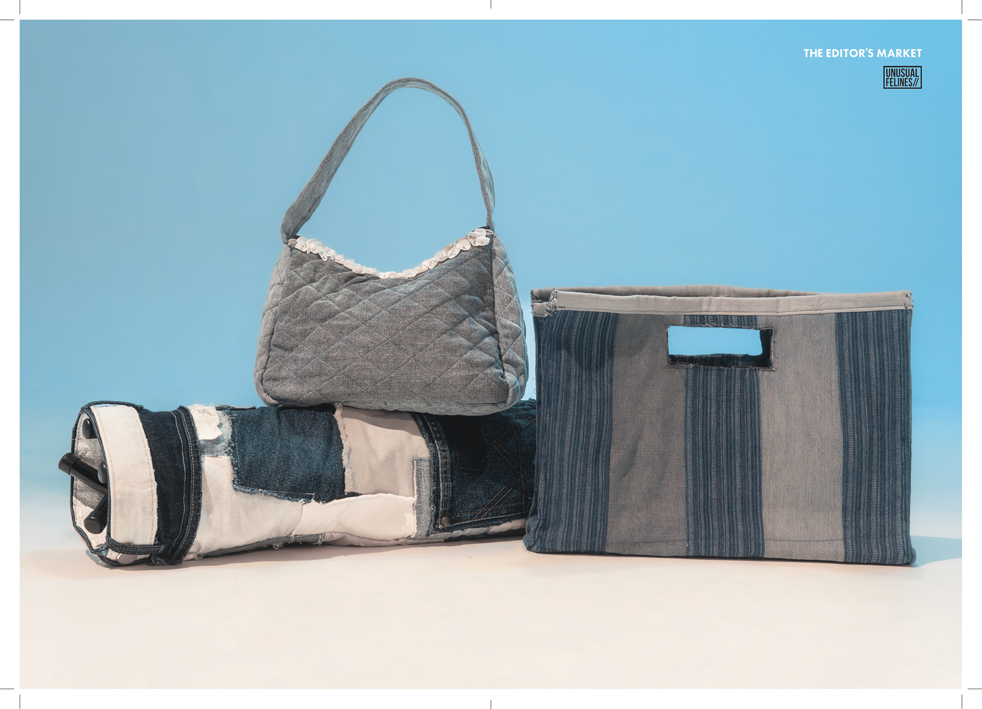
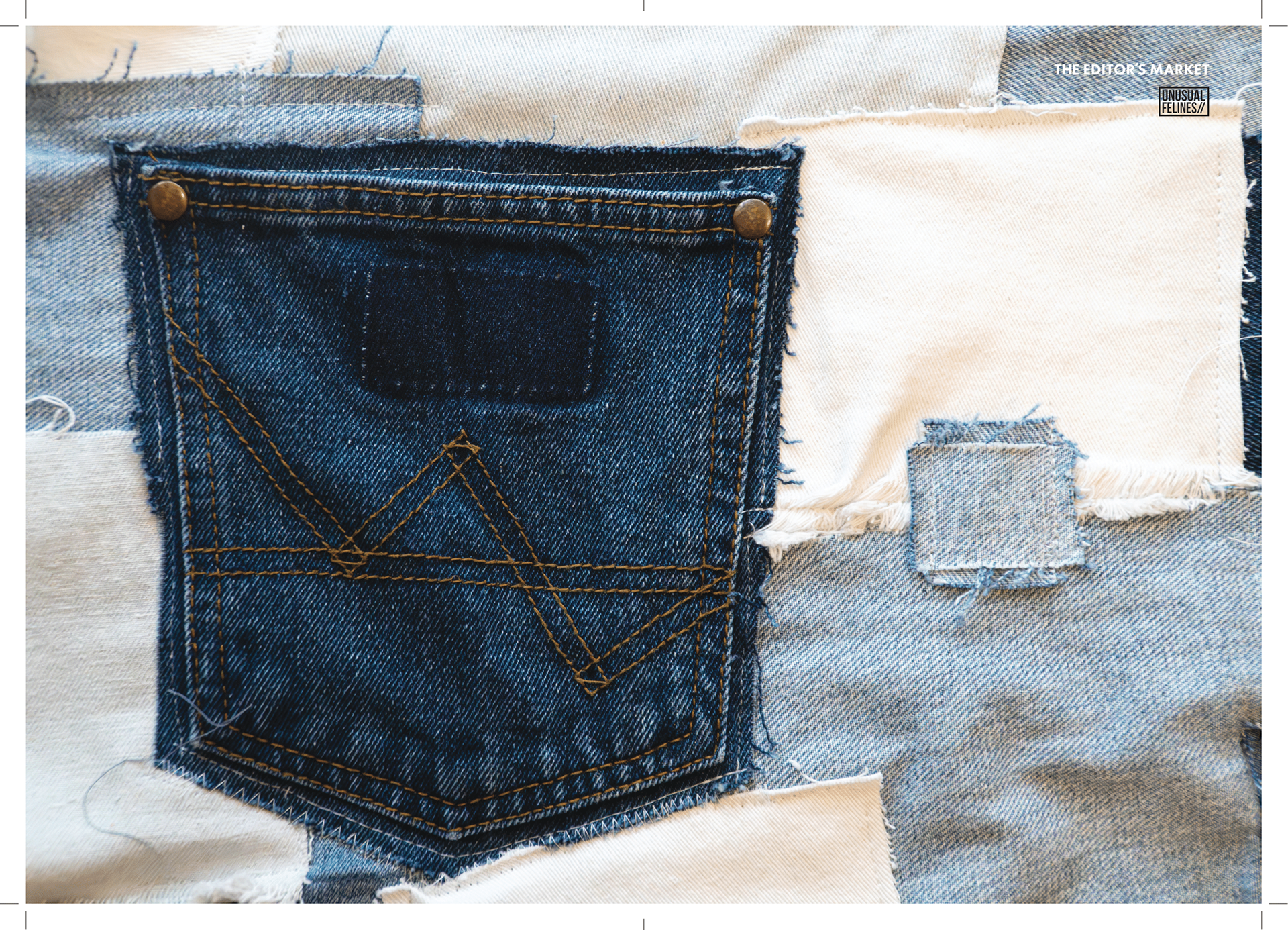






A PERSONAL REFLECTION
The Tapestry of Colours project stands as a culmination of thoughtful graphic design, immersive storytelling, and dynamic brand synergy. Through a cohesive visual identity that intertwined modern minimalism with vibrant expressiveness, the graphic elements served as the thread that wove each segment — fashion, lifestyle, sustainability, and culture — into a unified narrative. Every layout, spatial mockup, and branding touchpoint was meticulously designed to reflect the campaign’s core message: that individuality and community can coexist beautifully within a shared space.
As the creative director, editor, photographer, graphic designer, fashion stylist, and writer, I approached this project as both a visual architect and cultural curator. This holistic vision not only brings Tapestry of Colours to life — but it also transforms the idea into a living, breathing experience that could bridge art, fashion, and purpose across borders.
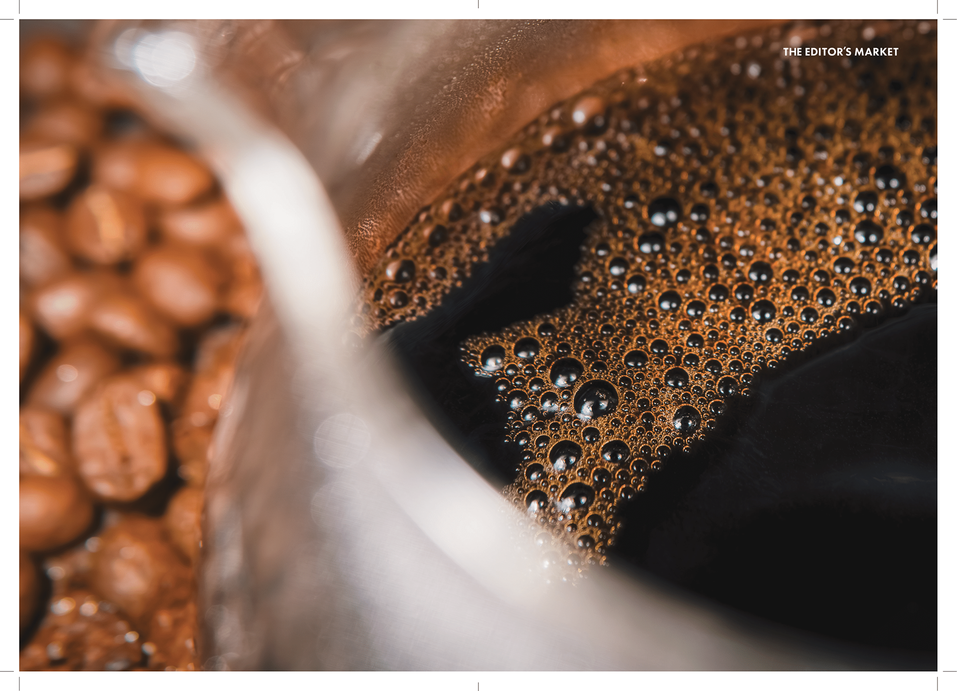
All photography shot by me unless otherwise credited for under PART 8: POSTFACE — CREDITS
Read the Press Release here.

